Putting the driver first in a connected vehicle ecosystem.
Overview
For the Lynk & Co 01 and Zeekr 009 infotainment system, I worked as a UX/UI Designer in a highly technical, cross-functional environment. The challenge was to design an intuitive, scalable interface that aligned with the brand’s identity while meeting the needs of both drivers and developers.
I was responsible for driving UX from research to implementation, ensuring that the system was not only user-friendly but also technically feasible within a complex automotive ecosystem.
Categories
Embedded systems
Infotainment
HMI
CEVT (Now Zeekr)


The goal was to design an infotainment system that felt intuitive and aligned with the brand’s identity, while also being efficient to implement from a technical perspective. This meant balancing user needs, brand expression, and system constraints throughout the entire design process.
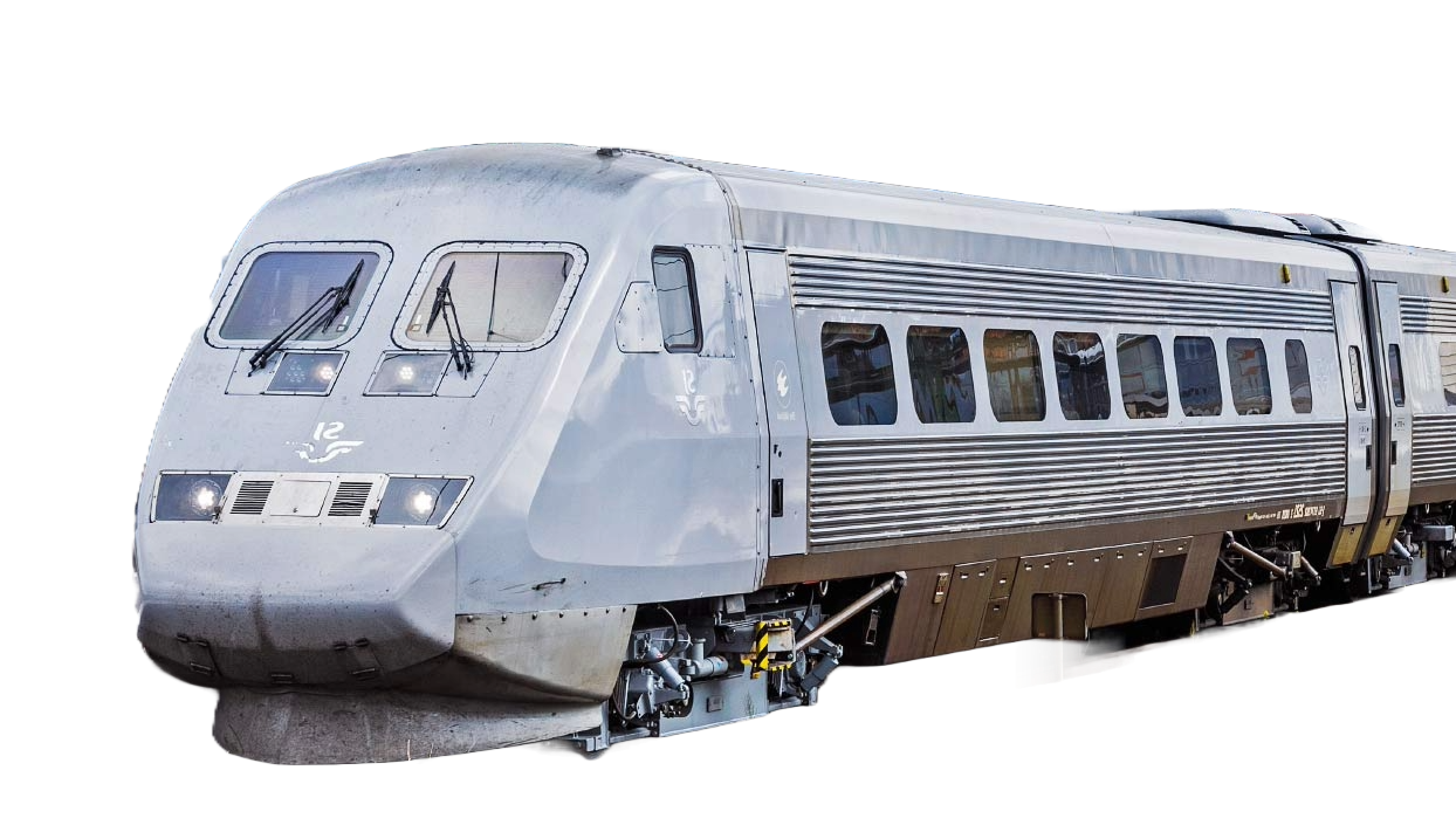
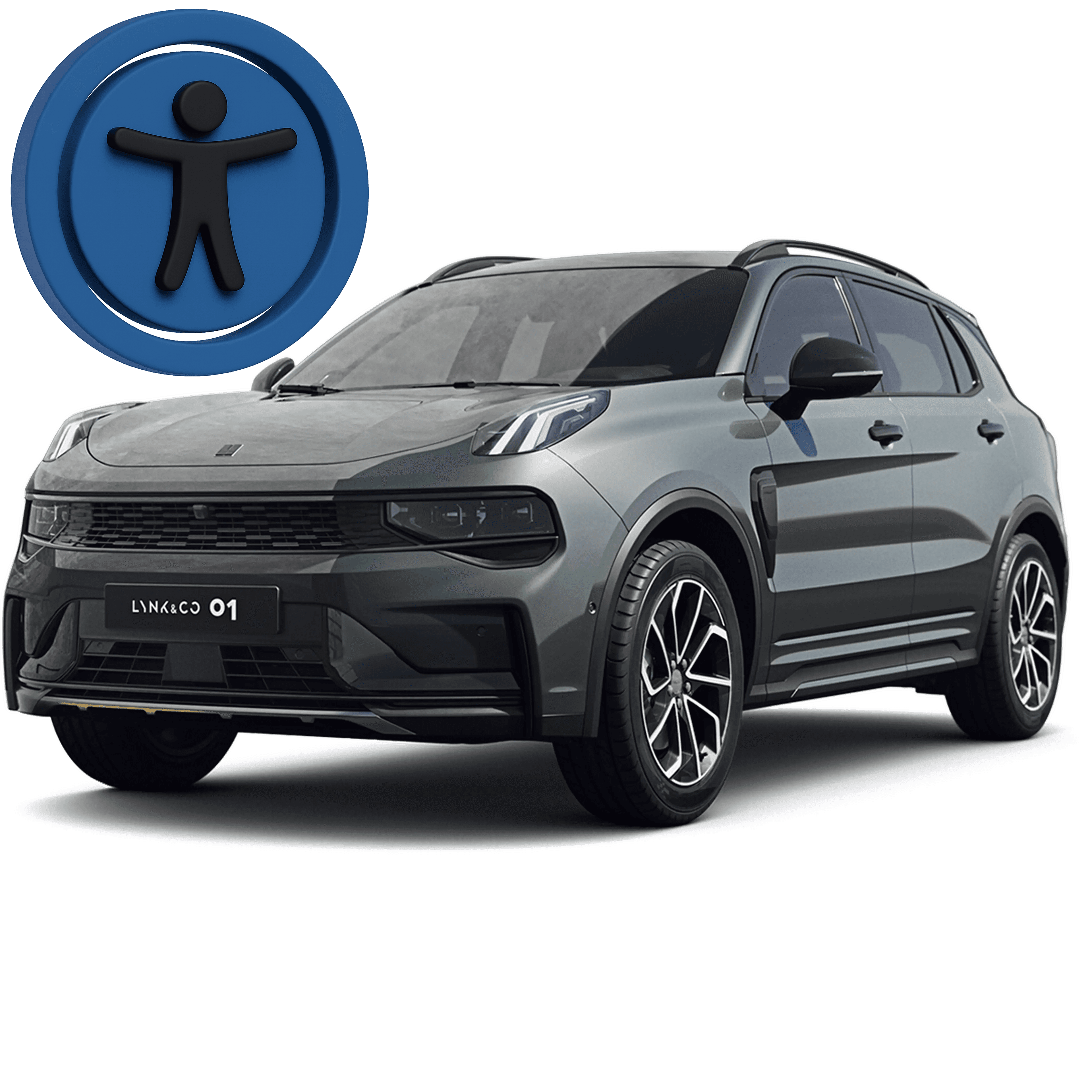
The system was developed for the Lynk & Co 01, with the intention of scaling to Zeekr 009. This required creating a design that felt fresh and modern, while still integrating with the existing Volvo/Geely design language. One of the main challenges was handling the complexity of features and interactions without overwhelming the user, especially in a context where attention is limited.


To balance familiarity with innovation, we grounded the work in user research and continuous validation. Early in the project, I observed how drivers interacted with existing systems and noticed that many relied heavily on muscle memory and predictable interaction patterns. This insight led me to prioritize clarity and consistency over purely visual differentiation.
In parallel, I collaborated closely with developers to understand technical constraints early on. Instead of moving directly into high-fidelity design, I started with low-fidelity wireframes to validate structure and interaction flows with both stakeholders and engineers. This helped identify implementation challenges early and reduced rework later in the process.
A key part of my role was improving the quality of UX specifications. In earlier phases, unclear handovers had led to inconsistencies in implementation. By documenting interaction states, edge cases, and behaviors more clearly, I made it easier for developers to translate design into code and reduced unnecessary back-and-forth.
In addition to the core system, I worked on third-party infotainment apps such as Spotify, Audiobooks, and Radioline. The challenge was to integrate these services into a cohesive in-car experience while maintaining both brand consistency and usability.

As a first-time project lead, I learned how critical clear communication is in complex environments. Early in the project, gaps in alignment created friction between teams. By introducing more structured documentation and regular syncs, I ensured that designers and developers had the information needed to move forward efficiently.
I also developed a stronger systems thinking approach. Maintaining and structuring Sketch libraries was not just about design consistency, but about enabling faster iteration and reducing inconsistencies across teams working on the same product.
Another key insight was the importance of detailed UX specifications in technical environments. When interaction behaviors were not clearly defined, it often led to mismatches in implementation. By documenting states, edge cases, and flows more clearly, I improved collaboration and reduced unnecessary back-and-forth with developers.
Working within technical constraints strengthened my problem-solving skills. Instead of pushing ideal solutions, I collaborated closely with developers to find alternatives that balanced usability and feasibility, which helped avoid rework and ensured realistic outcomes.
Finally, adapting to agile ways of working required me to validate ideas earlier and more frequently. This shift improved both the speed of decision-making and the overall quality of the solution.